
Role
Brand/UX Strategist
Project Type
8 Weeks
Project Length
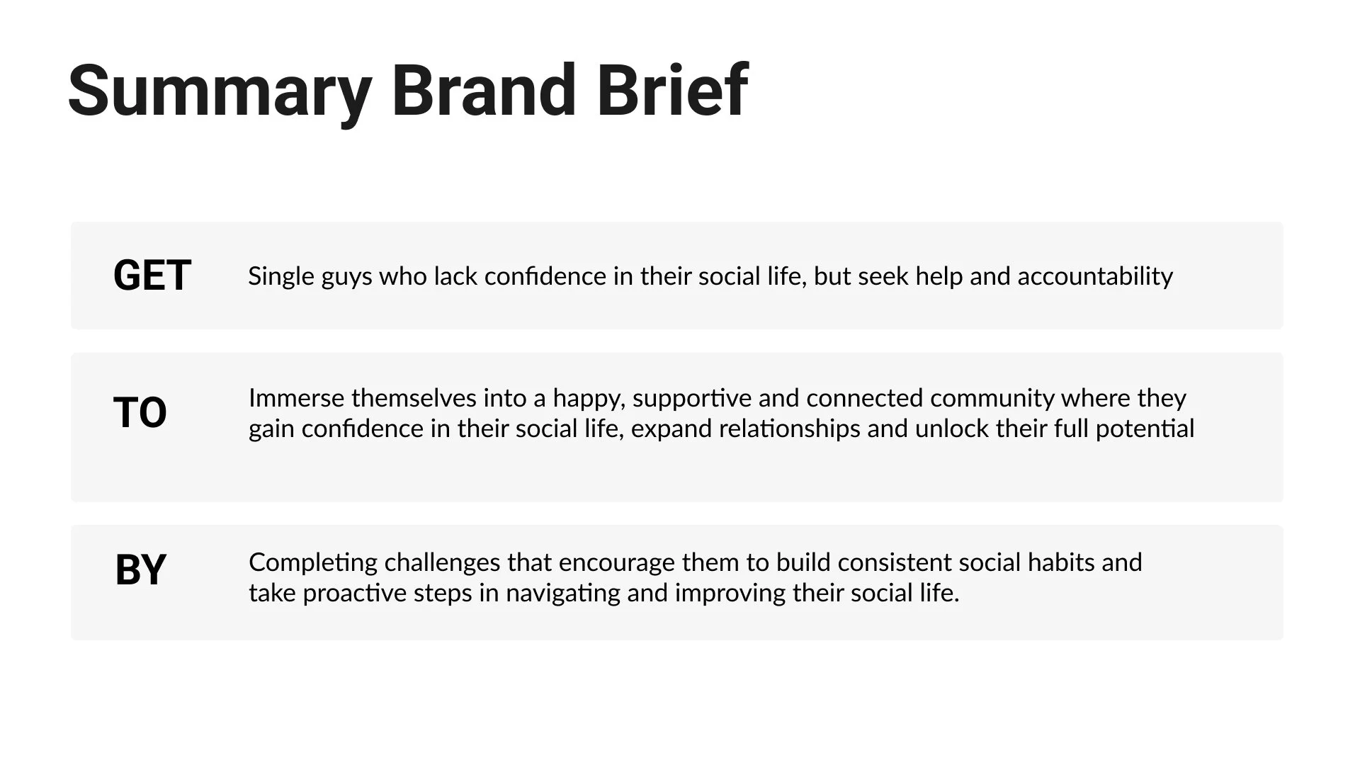
Client Grad School Project- 6 person team
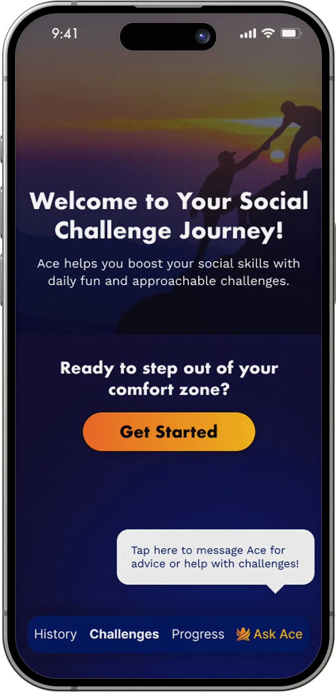
With Ace by Your Side, You’ll Never Fly Solo Again
Dating apps reward performance. The manosphere sells dominance. Neither actually builds confidence. As part of a graduate program in Strategic Communication Design, our six-person team took on a real client with a real question: how do you help young men get out of isolation without making them feel like a project? That became Ace.
I served as Brand and UX Strategist on the team. I wrote the creative brief, defined the brand positioning, built the voice and personality system, and developed the brand book that guided the user flows from onboarding through challenge completion and reflection.
The Challenge
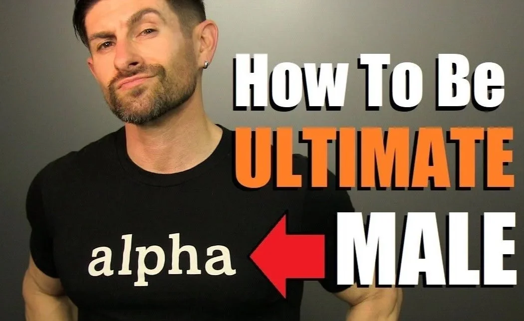
Young Men Deserve Better Than the Manosphere
A generation of young men is being shaped by an online culture that mistakes dominance for confidence and performance for connection. The self-improvement market has made it worse.
Most products in this space talk to men like they are broken, need fixing, or worse are soft beta males.The result is an audience that is isolated, skeptical, hyper self-critical, and already burned by advice that did not workout for them.
Our client came to us with only a rough sketch and a genuine alternative. Our job was to build a brand and experience system credible enough to earn trust from people who had stopped trusting.
The Insight
Permission to Be a Beginner
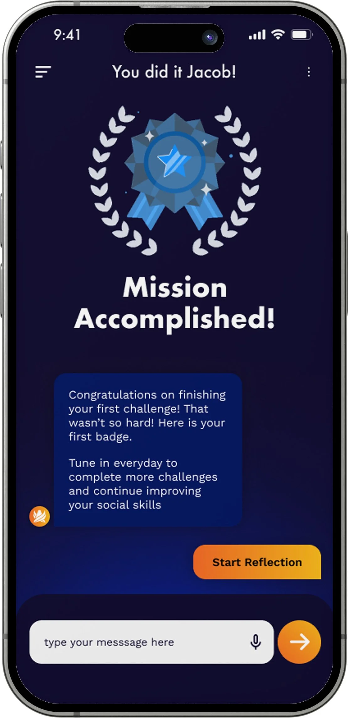
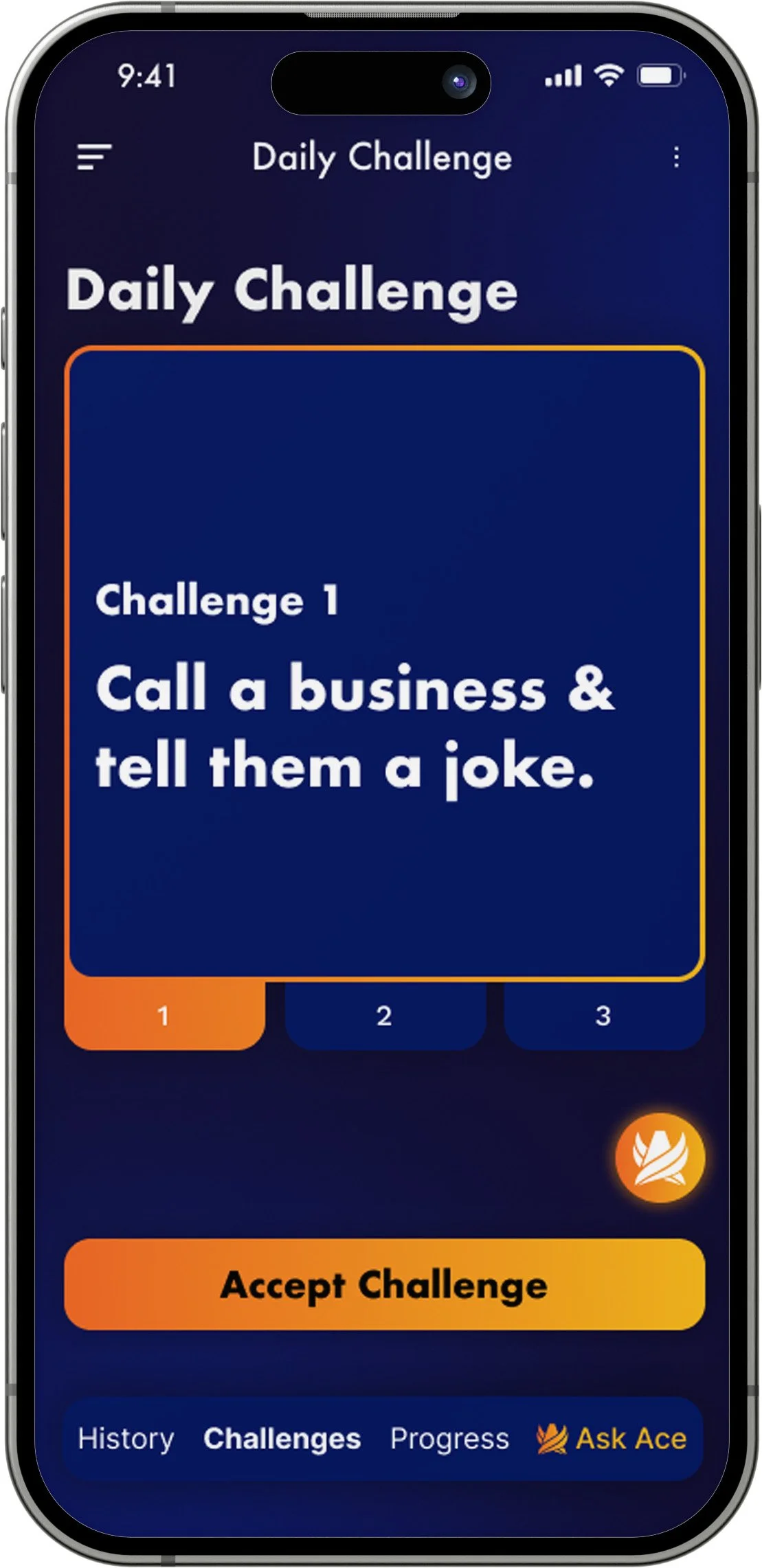
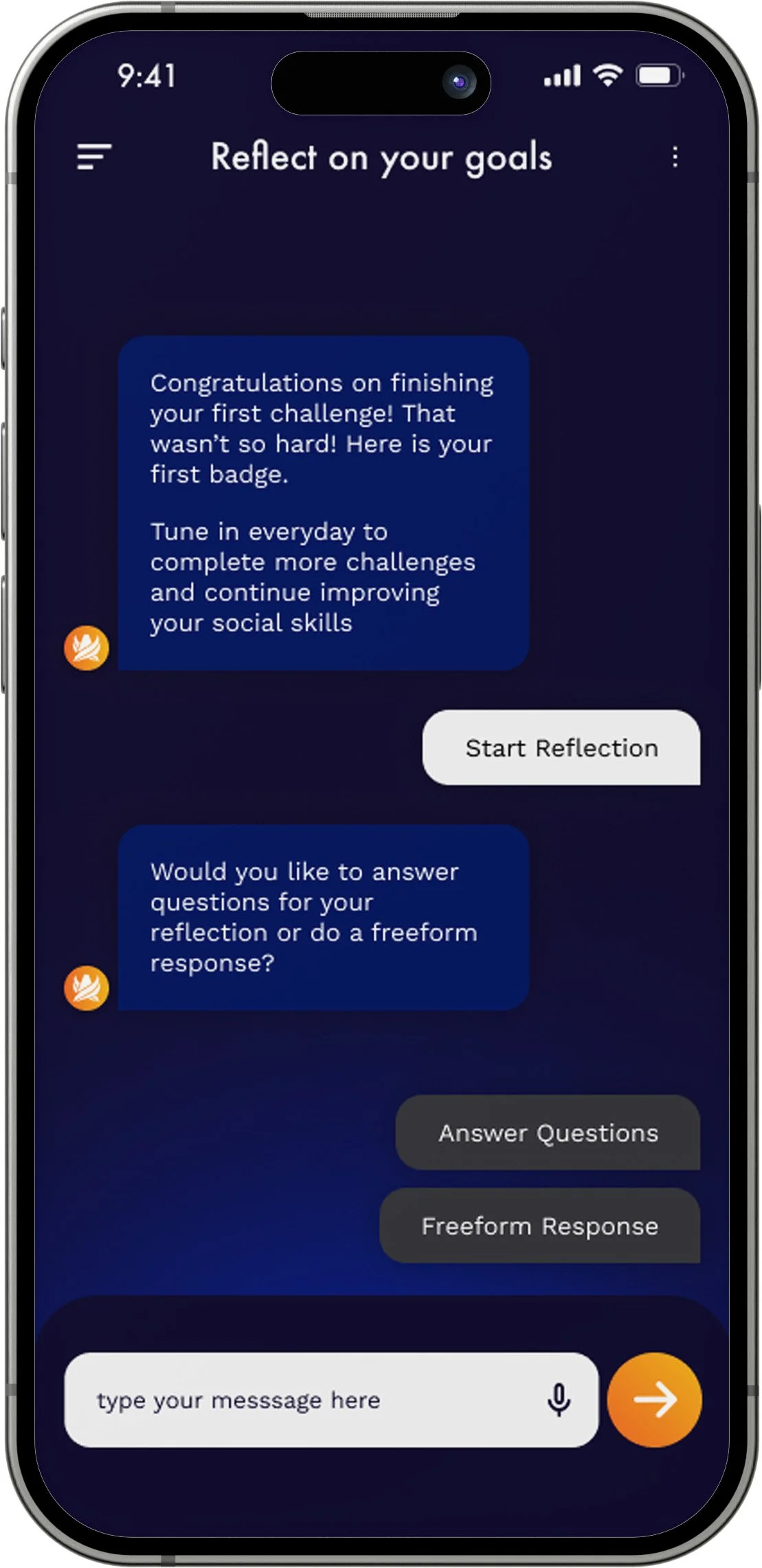
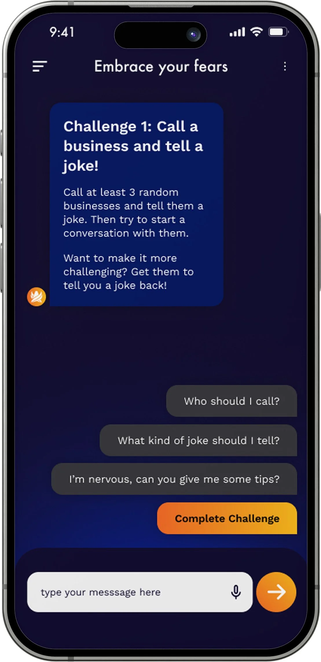
Most self-improvement products for young men are built on the idea of fixing them, but "fix" implies broken, and when those systems fail, users blame themselves instead of the product. The real tension is that young men are often less embarrassed by struggling socially than by admitting they need help at all. ACE had to work against that. It couldn't feel clinical, performative, or like another manosphere voice selling certainty through shame. It had to feel human, like someone genuinely in your corner. A true wingman. The idea was simple: give users a trusted presence in their pocket that helps them take small social risks and build confidence through real-world action, not passive consumption. Not transformation. Just momentum, one challenge at a time. The brand had to support before it could inspire. Confidence comes later. First, people have to feel safe enough to try.
Brand Strategy
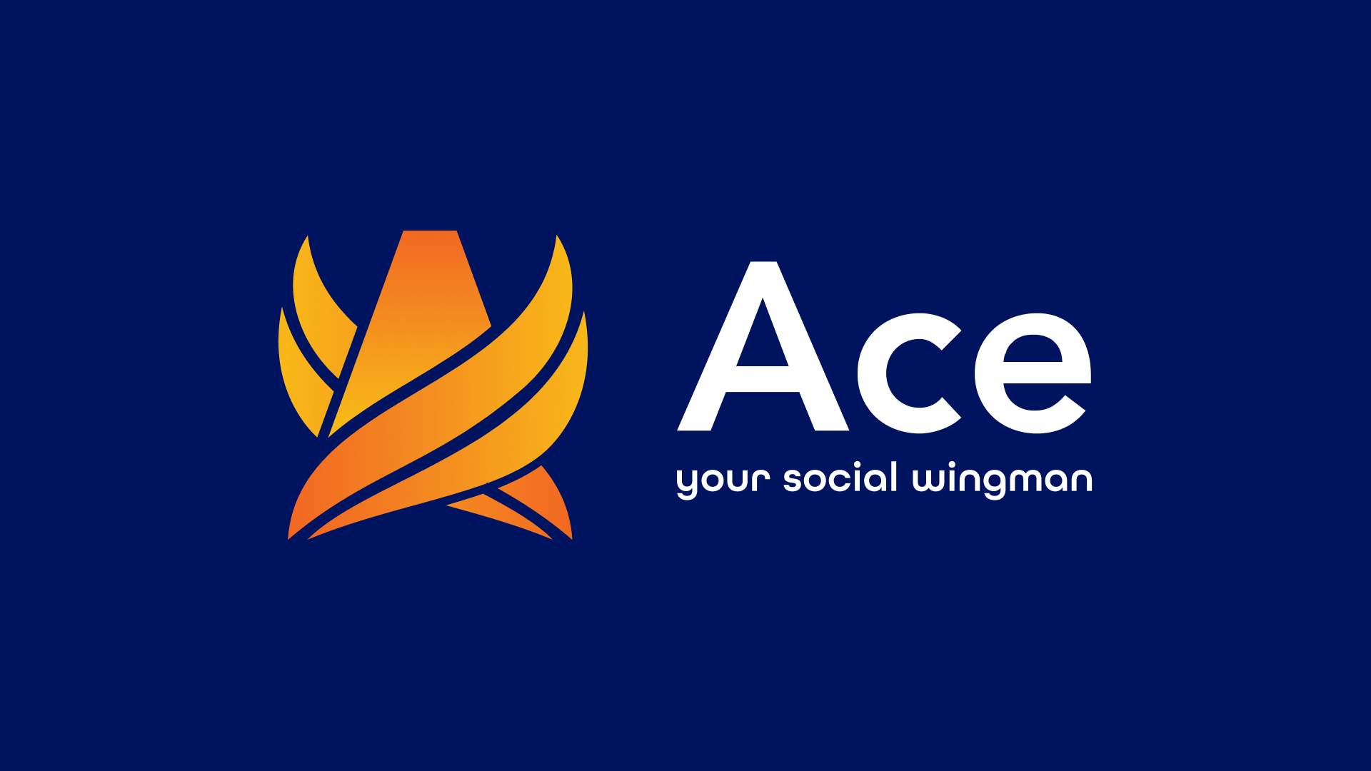
Take These Wings And Learn To Fly
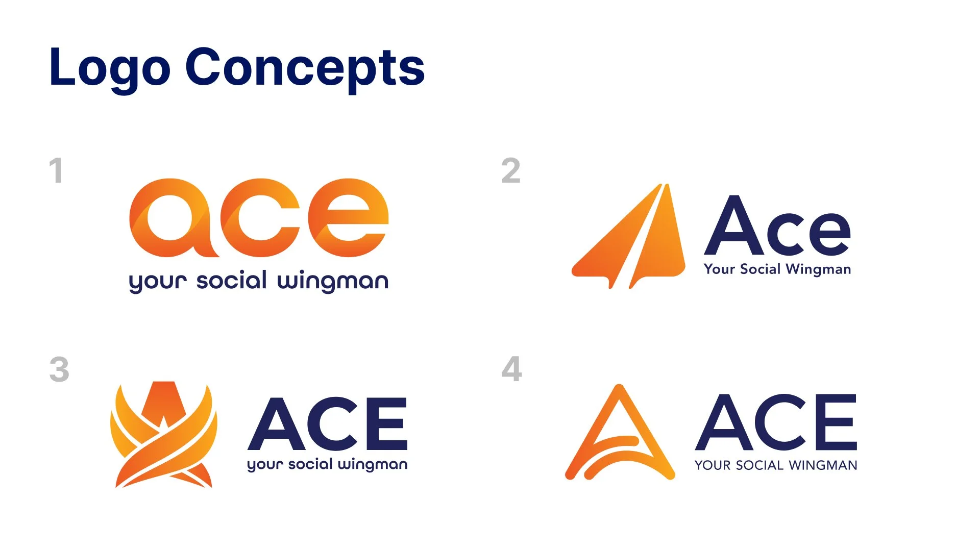
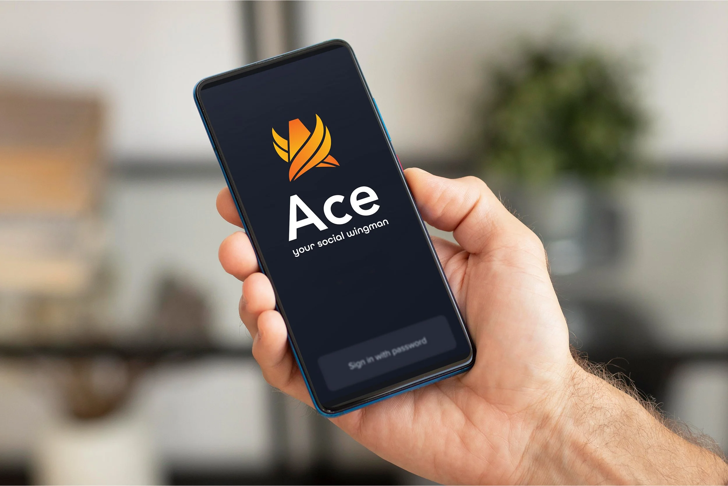
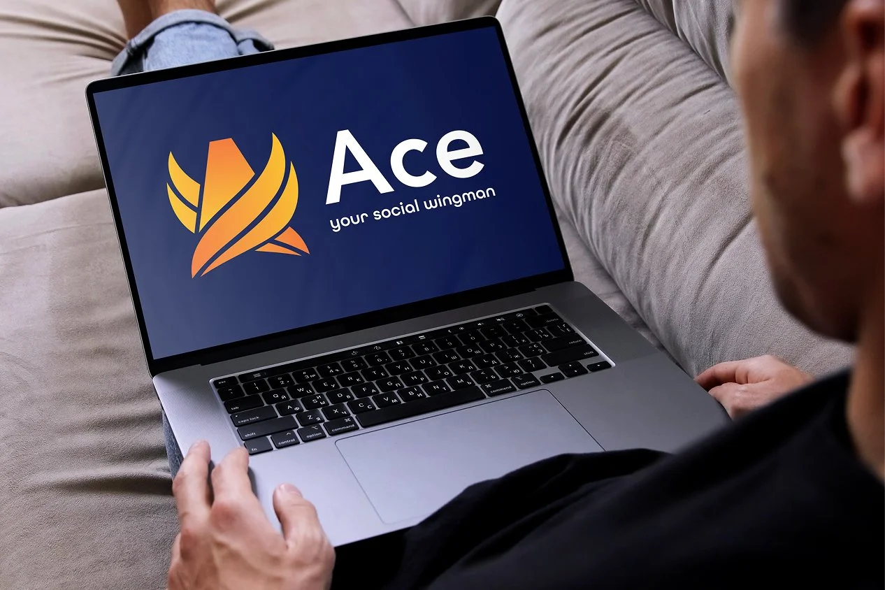
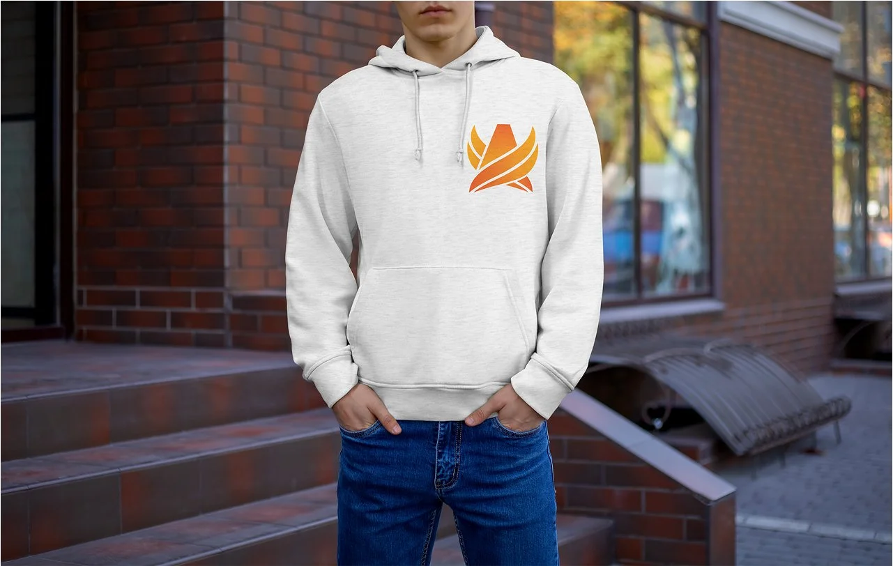
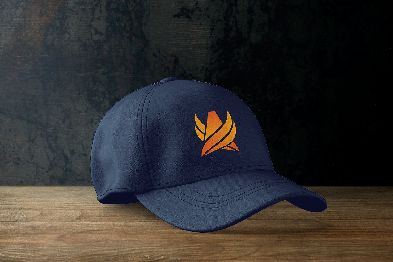
The wings in the Ace logo wrap around the A rather than rising above it. That distinction matters. It makes the wingman idea literal. The brand is beside you, not ahead of you. The gradient moves from deep amber into sunrise orange, which brings warmth and forward motion without aggression. The form feels grounded. It rises with you rather than waiting for you at the top.
Every visual choice ran through the same filter: does this feel like support, or does it feel like pressure?
UX/UI
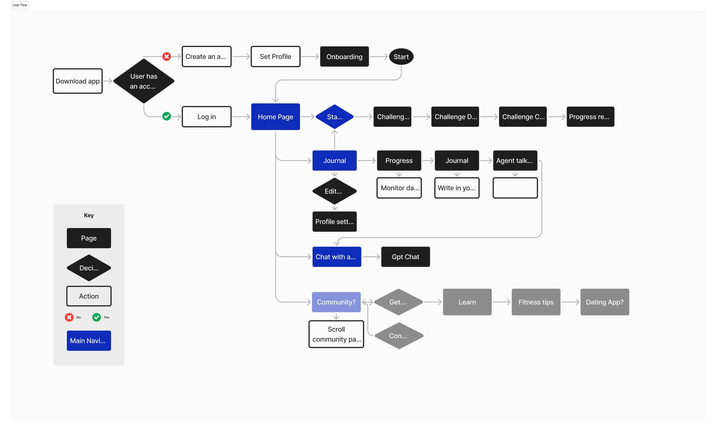
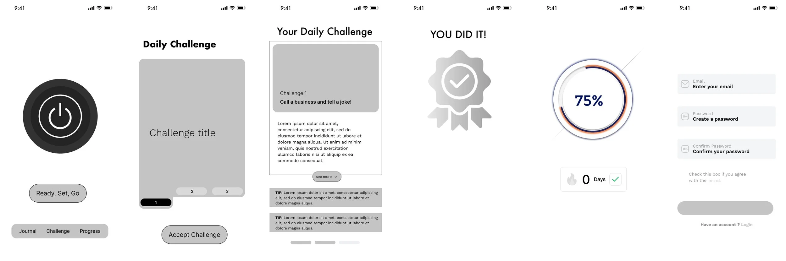
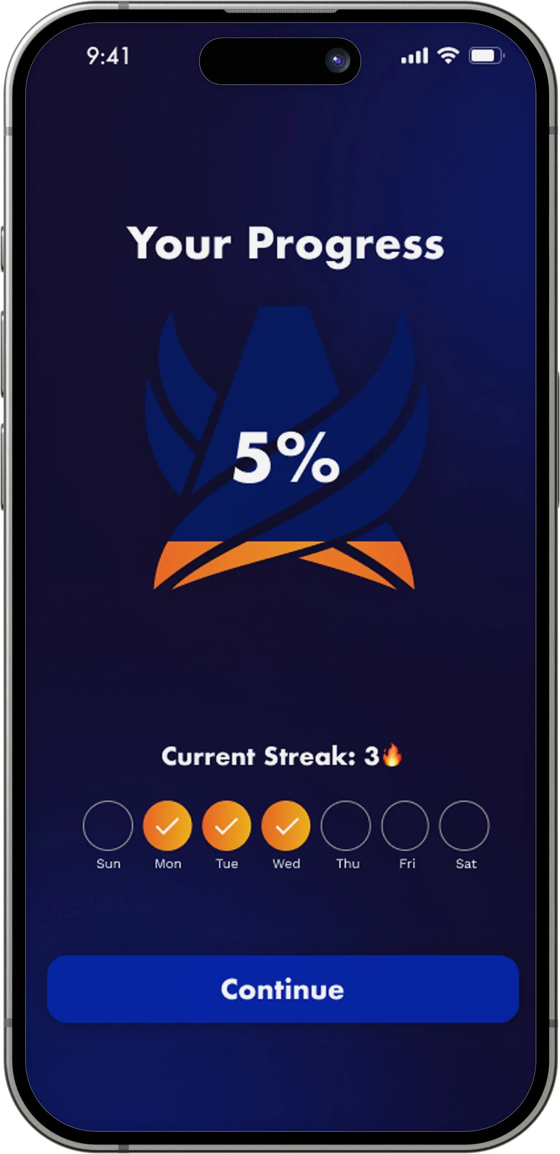
Once the wingman position was set, every screen had to answer the same question we used on the identity. Does this feel like support, or does it feel like pressure? That question shaped the UX. Onboarding doesn't ask the user to set goals, because goals imply you're behind. Challenges can be skipped without penalty, because penalty turns a wingman into a coach. The progress ring fills slowly. A fast ring rewards speed instead of effort, and effort was the thing we were trying to celebrate.
Key Take Ways
This project taught me that strategy matters most when the audience is already skeptical. The men Ace was built for had tried self-improvement before. They had watched the videos, read the threads, and still felt stuck, which meant any hint of transformation language would confirm what they already suspected: that this was another product that didn't understand them. The hardest constraint to hold was the one that made the work better. Early on, we considered building a community feature, but for this audience, community risked becoming another place to consume content and call it growth. The product needed to move people off screens and into their feet, and keeping that boundary made the challenge-based design more honest. If I did this again, I'd spend more time testing the tone of the challenge prompts with real users. We made confident decisions about voice, but the moment a product speaks directly to someone feeling anxious, every word carries more weight than it does in a brand book.